Embrace your True Colors!
Posted by David Zyla | Filed under News and Updates
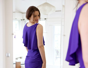
Flattering colors make a much greater impression than neutrals. Each color can be synced up with an emotion, a place or a period of history. For example, yellow might evoke a sunny day while Wedgwood blue is reminiscent of the 18th century. At the end of the day, neutrals are, well, neutral. The woman in merlot, turquoise or buttercup is the one we remember. So, if an item is available in both a neutral and a color, go for the latter!


